Uncategorized

Fun little piece

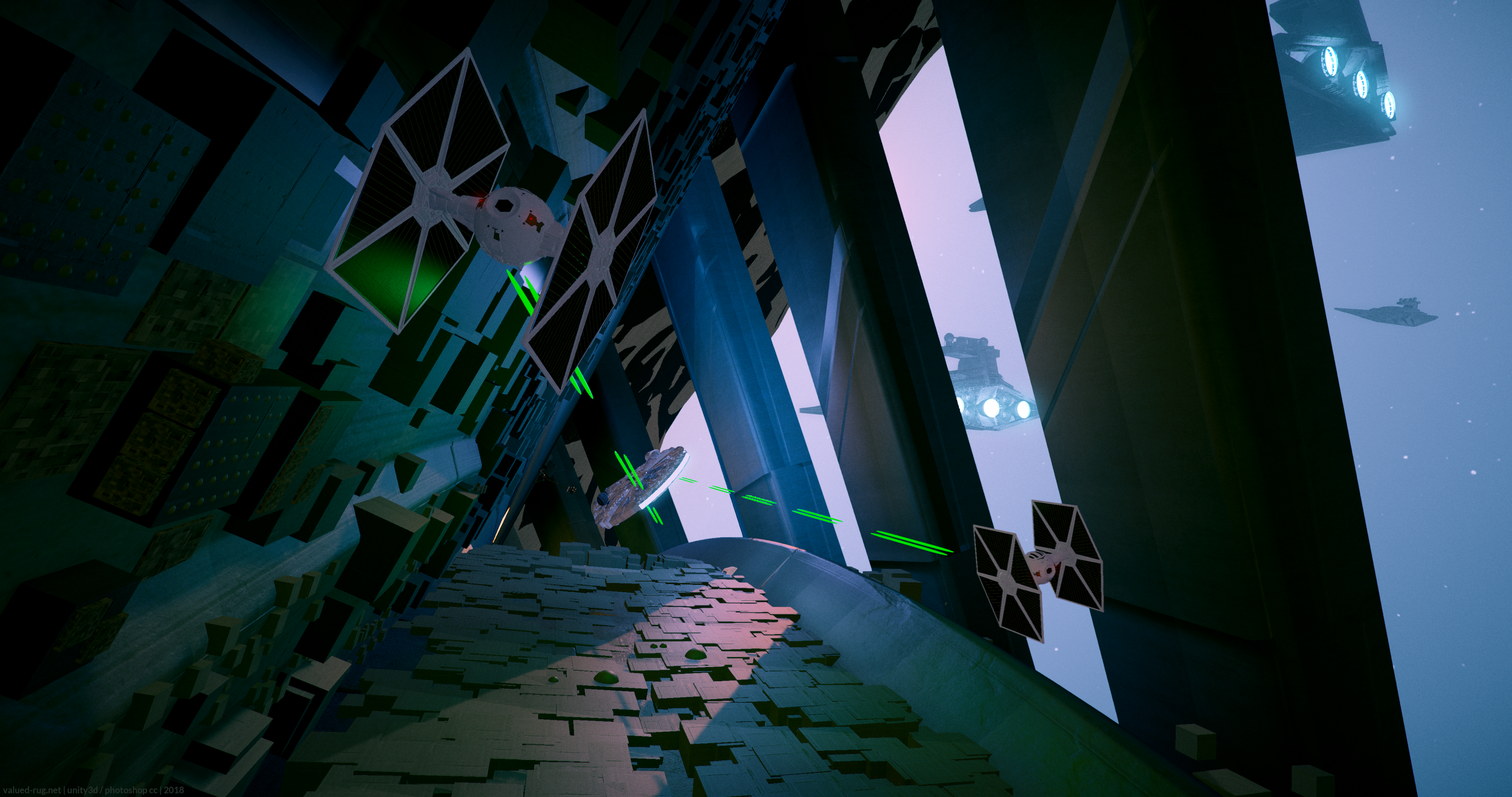
Star Wars chase in Unity
Star Wars themed chase scene made in unity with some stock assets and lots of retouching in-engine. Miminal color correction done in photoshop at the end.

Here’s a concept done entirely in Unity, except for a bit of color correction in photoshop. It has too much of a videogamey look to be true to Star Wars, but I’m OK with that. This started as an entry in a Polycount contest a couple of years back. I had to leave on a vacation before the deadline, so I scrapped it. I wanted to portray the usual contrasting scale seen in the Star Wars universe, and use the Courtyard Scene in an unexpected way.

The scene is the Courtyard asset from Unity, Star Wars models are free ones found online. I achieved a bit of a greebly effect by using the MegaScatter plugin to propagate primitives on surfaces of the level. These I’d go back and redo if I had time. I’ve tweaked all of the lighting and materials extensively, and created the tie fighter blaster, falcon engine, and star destroyer engine effects from scratch in unity.


A Look Back: Bank Heist Prototype

So many games wind up in development hell, and it’s not uncommon to work on things that never see the light of day. Many projects are cancelled in public failures that dishearten fans and tank stocks. But many more games are tripped up before they are even announced or experienced by the public at large.

As game developers we can learn a lot from these experiences, but many times we simply can’t talk openly about them. I wanted to start a series of posts covering my personal best example of the one that got away.

For me that game was called Bank Heist.

The Setup

Bank Heist was a prototype made using the Source Engine. The game was to finally address the dearth of decent Cops and Robbers games in the market at the time (2009-2010). There was simply nothing like BH, and that excited us more than any project we had worked on in the industry before.

As Lead Designer at Controlled Chaos, it was my role to meld the original paper napkin vision CEO Hunter Woodlee brought to us into a tangible game design. Being a small independent developer, I was also the Level Designer on the project and designed player feedback, player and npc classes, UI, etc. I also created our various test sandboxes, and ultimately the main level seen in the few public videos of Bank Heist that are available out there.

Hunter’s initial idea was a cooperative Heist game – like Left4Dead in a bank. (If your mind is already going to Payday, I’ll cover that in a later post). Our team members jumped at the opportunity to create a game like this, but a key part of the Cops and Robbers feel was missing- we wanted to be either bad guys OR good guys.

Through several rounds of brainstorming and rough prototyping, the heist idea was expanded. Not only would robber players cooperatively complete heists amongst AI cops and civilians, cop players would battle against them, sometimes taking on hidden roles.

In the early stages we didn’t know if players should travel through a linear set of disconnected levels ala L4D, a more circular style of objective gameplay like CS or CoD, or a massive set of push sectors like in Battlefield.

We did know that the game we wanted to make would need a large quantity of feedback delivered to players, levels and player abilities that were dynamically customizable, multiple player modes and game stages within a round, and key attention paid to the moment to moment choices that players would be offered to make.

Overall the game would need to deliver on the promise of both pulling off a master heist, and thwarting the bad guys in a way that made the player feel more like John McClane than Paul Blart.

Example Gameplay

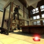
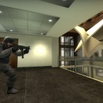
Here is a playthrough of our bank level, with a robber team that takes a no-holds-barred approach. As a reminder, this was a prototype made using Source, with Counterstrike assets such as the weapons, and some textures and models from other Source games. Much of the game assets are original, but low quality since we didn’t have a bar set for graphics or performance at that point.

It’s a live capture of a real multiplayer match, and none of the gameplay is faked except for the scripted moment with the tear gas. In another post I’ll go into how and why this level was made.

I’m excited to share some of our design decisions with you in future posts.


The Smoke has Cleared: Analyzing Workshop Stats for De_Boardroom

In early February, I posted my CS map, de_boardroom to the csgo workshop. Here’s the breakdown of how the map was received, and a brief outline for future versions of it.

Initial Fervor

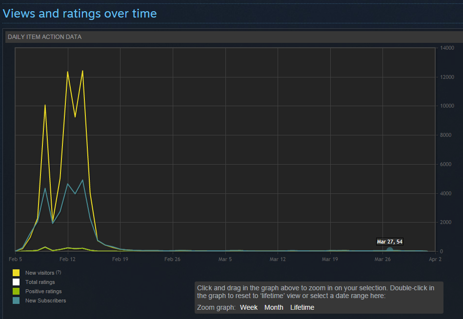
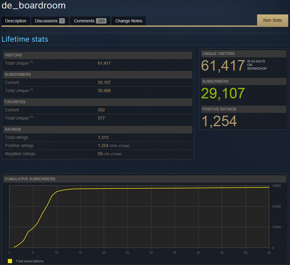
The CSGO Workshop mimics other game marketplaces. You make all of your downloads in the first one to two weeks. Notably, within the first day the map sputtered to life, then picked up a steep- then steeper rate of downloads.

An interesting trend emerged: The number of New Visitors vastly outnumbers the actual Subscribers once the map hit the Front Page of the workshop. This ratio finally settled at about 50-50 which is actually a pretty amazing click-thru compared with some of the shipped titles I’ve worked on.


stats_de_boardroom_2015040101


Competitive Scene

Ultimately, the feedback I received via comments was mostly positive (after filtering out the majority of the comments, which are spam). The experimental nature of the level design meant that I was never going to make it into any servers playing Competitive CS. But that was OK, my goal from the start was to explore a non-traditional CS map style.
 

stats_de_boardroom_2015040100


Bugs & Revisions

Though I did release several new versions of the map, they were mostly bug fixes. One was a severely bad bug, which might’ve affected my downloads during the key time period. However I did fix it and engage with some users who had keyed me into the bug.

My Trello board for the map still lists several serious bugs, and a lot of additional tasks that I’ll go into in a minute. The bug fixes will have to wait, as I’m swamped and this is after all a “free time” project.

Community Testing

One thing that I will add to my process in the future is to facilitate playtesting with the community in a more open way. Mapcore has a dedicated testing time set up which I plan to use, and I’ll also run the map on my own server. I knew that I should be doing this but wanted to have an initial limited release – I didn’t expect to get so many downloads on this first go-round.
de_boardroom0030

Future Development

The plan with de_boardroom:

1] There are a few gameplay tweaks that need to be made to the flow that will come now, and some will come later. In general, to make it into a great CS Demolition map worthy of a place in a CSGO map pack, the level would have to be largely broken up, and spread into the typical CS layout. That’s not happening, because-

2] The main plan as far as gameplay is considered is to create a new game mode, along the lines of Spies vs Mercs from Splinter Cell, or the Infiltration phase of Vice and Virtue. Features like extensive overlapping floors, multiple points of egress, and a single, gaping weakpoint for the Terrorists, will dovetail nicely with a slower-paced yet high stress style of play. More on this in a future post.

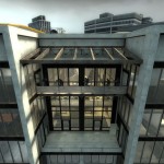
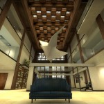
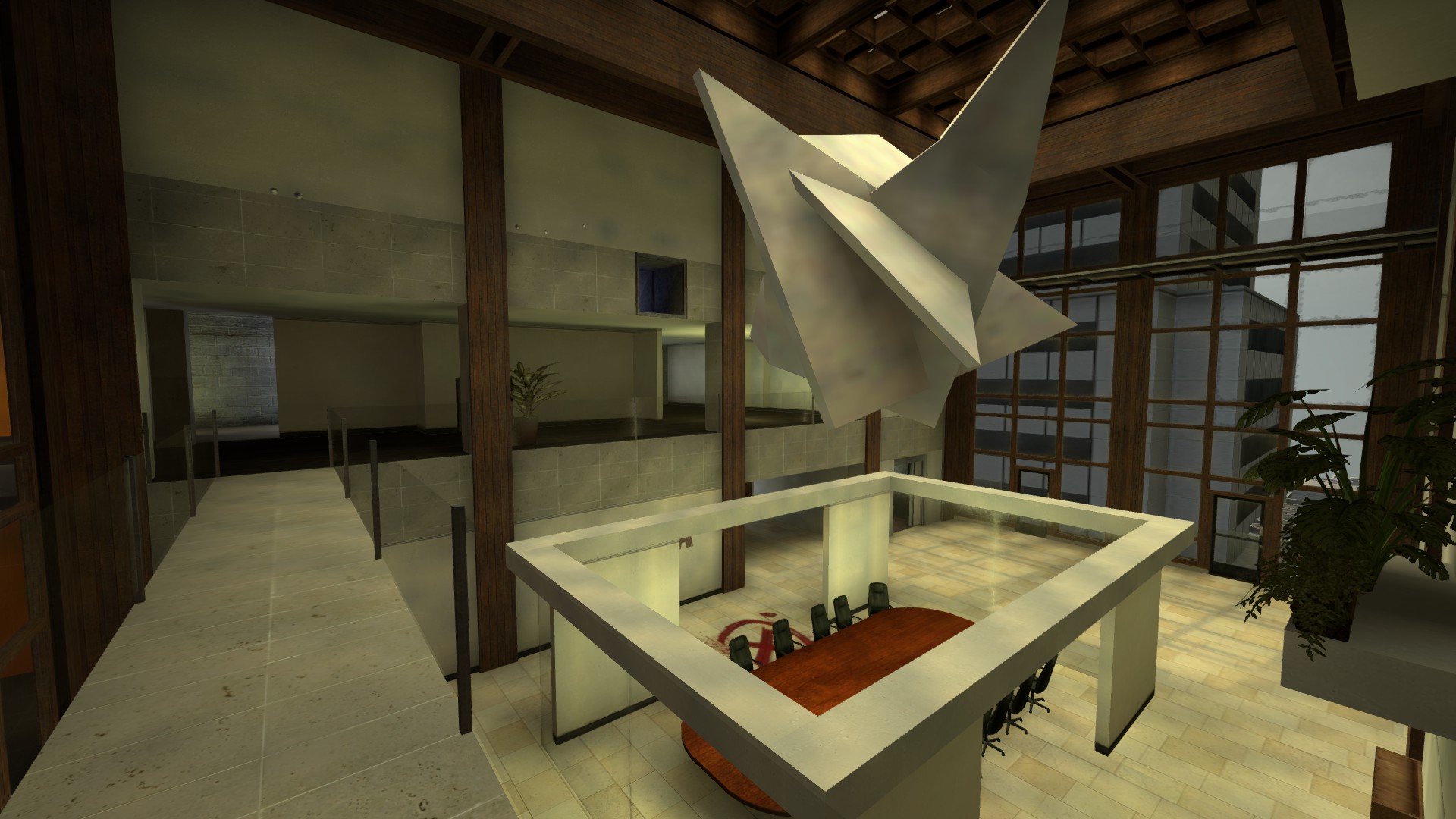
3] The art of the level got a lot of compliments. However there are zero custom models made outside of hammer. I went old-school and created bsp based geometry, and exported them via Propper. There’s nothing exactly wrong with this – but there is a lack of some certain architectural details on the exterior, and the large modern sculpture hanging in the atrium is literally a blurry, blocky set of detail brushes. All have planned models and textures that need to be created and inserted.

4] Character. I’m actually happy with a lot of the areas in the map, but much of it is like a broken bridge that has no rubble underneath it. By that I mean, there is a missing narrative element that can only come through additional models and textures. Where is the building, what company has this modern take on a stodgy style office, who sat at this boardroom table and why do terrorists want to destroy it? I have a detailed story to tell, and I know some players will really dig it.

I have had all of this in my head, docs, or in collections of reference, for 18 months, and I’d like to go on and get it out.

5] If you got this far – here’s another tidbit. There’s a secret plan to embed some secret content into this map. I can say no more.

Thanks for visiting. Check it out on the workshop if you haven’t yet:
stats_de_boardroom_2015040102

de_boardroom level design work in progress – new architecture

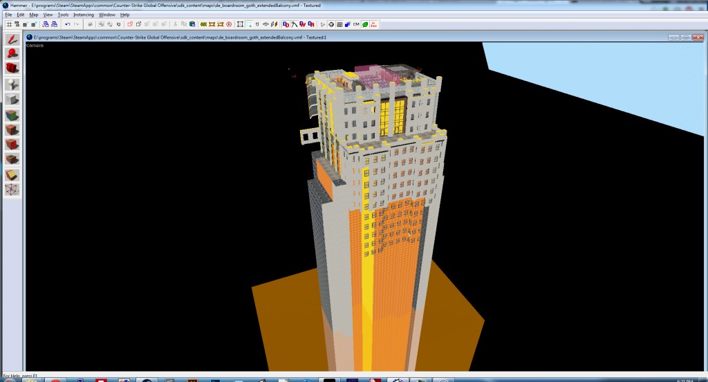
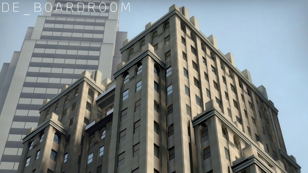
After a lot of debating and hem-hawing, I’m switching the architectural skin of the building from a generic modern look to an older and move developed Neo Gothic (with a touch of Art Deco) style. The old floor to ceiling windows on most rooms will be gone, and the general feel of the level will be much more rich.

Originally, I started this level before the now-famous Agency was released. Agency is an amazing work, and though my original goal was to create a modern skyscraper with that sort of detail, I never solidified the exterior design and what exists on the outside (and parts of the inside) are too reminiscent of Agency. This is not to say I’m drastically changing the flow, but the level finally has a real theme, instead of what was essentially a generic modern building that could be backdrop material in GTA.boardroom_neogothic01


That said, here’s an early shot which shows the new direction. The work is still rough and I’m working mainly at this point to nullify horrible redo mistakes by completely implementing this change in a copy of the level, then doing it again it in the actual level. Like in programming, everything is easier the second or third time you do it. Since I can only work at most a few hours a week on this project, I have to go in like a surgeon, or I would simply destroy a lot of work that would have to be redone over a course of weeks. Measure twice, cut once.

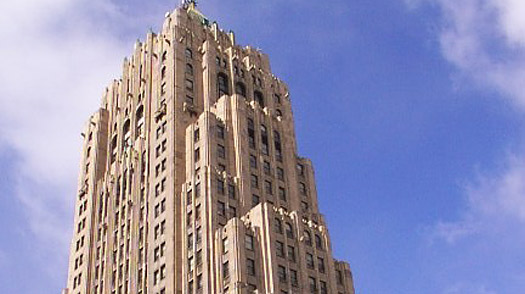
The styling and structure will be based off of a number of images and actual buildings, namely the Fisher Building in Detroit.

fisher_building

Screenshot Update – de_boardroom map for CS:GO

DAL-OIL


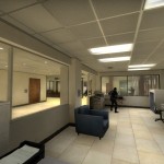
New shots uploaded tonight. I’ve been able to peck out an hour here or there on this map over the last month, and I’m at the point where I require feedback. I’ll be uploading soon, very soon, for some initial testing. I won’t be doing any more work on the map itself before uploading, but I do need to create a basic radar image for the hud.

Work in Progress 2: CS:Go Map de_boardroom

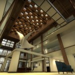
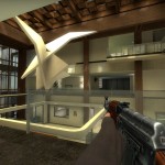
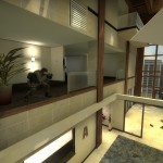
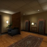
I have worked in a new look for the main atrium.

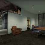
Major changes include the new wood look, and adding a small bit of cover around the boardroom table. I don’t want to add too much and I will also be adding furniture and potentially a few small walls down in the atrium, so this may change again. Also I made the sculpture have a bright texture for now, because it was vanishing and muddying up the player’s view. Ultimately I’ll have a real model in it’s place, probably something with a bright shiny bronze or copper patina.

de_boardroom0018


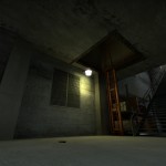
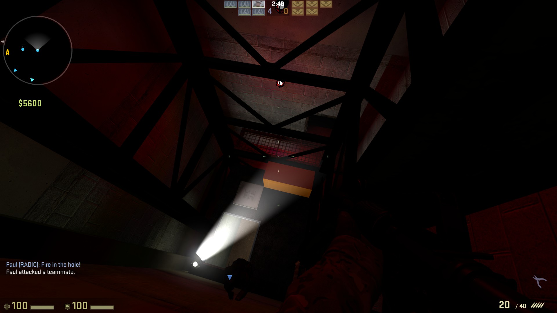
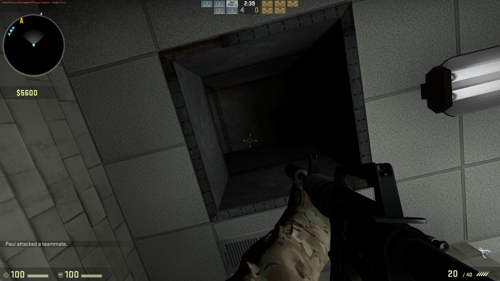
I have also reworked the elevator shaft, changing the location of the access hatch, and adding a short vent that leads down to the janitor’s closet. This will allow a choice of entering the atrium directly from the elevator, or from the janitor’s closet adjacent to it. The elevator shaft alone was a very direct route, but too easy to camp. CT’s were sitting ducks if they all decided to go that way.

de_boardroom0008The player pops out in the janitor’s closet via a drop down. It will take more playtesting to see if I need to add a way back up through this vent. My gut says yes.

de_boardroom0009

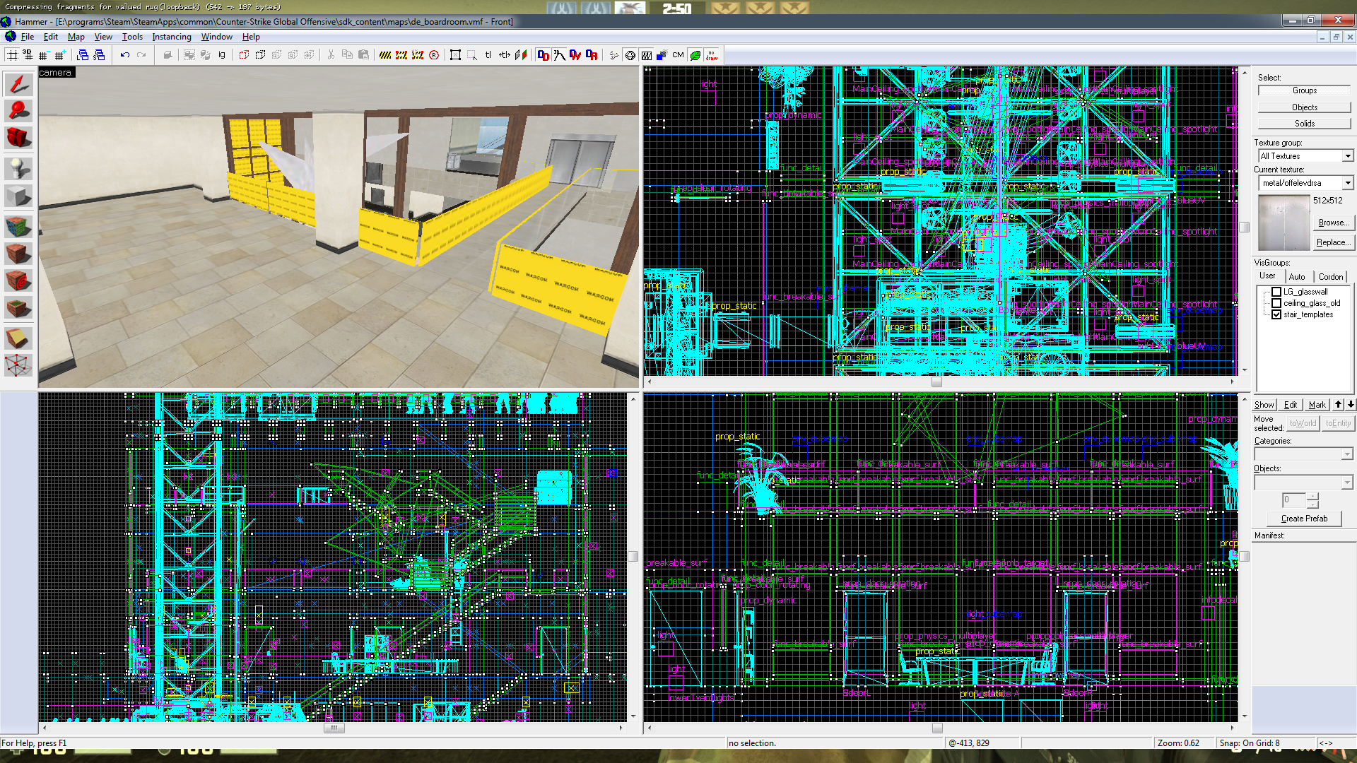
The final area that needs a lot of work is this upper tier. It is currently impossible for the player or bots to reach, however I mean for it to become a difficult to reach sniper’s nest. Both teams will have quick access to the landing, but it will require jumping and careful footwork. This will possibly balance the eagle-eye view that it will give the players that reach it.

de_boardroom0011_sniperlanding

Not too much longer and the map will be at a Alpha stage and I’ll start thinking about releasing it. So far throwing bots at it has come up with a fairly even split, but I have a few major choices to make before finalizing the nav mesh.

  • To make or not to make the north windows opaque in order to spread players out further before the first conflict?
  • Cover and new flow on the roof, atrium, and a few empty rooms
  • Finalize the look and feel.