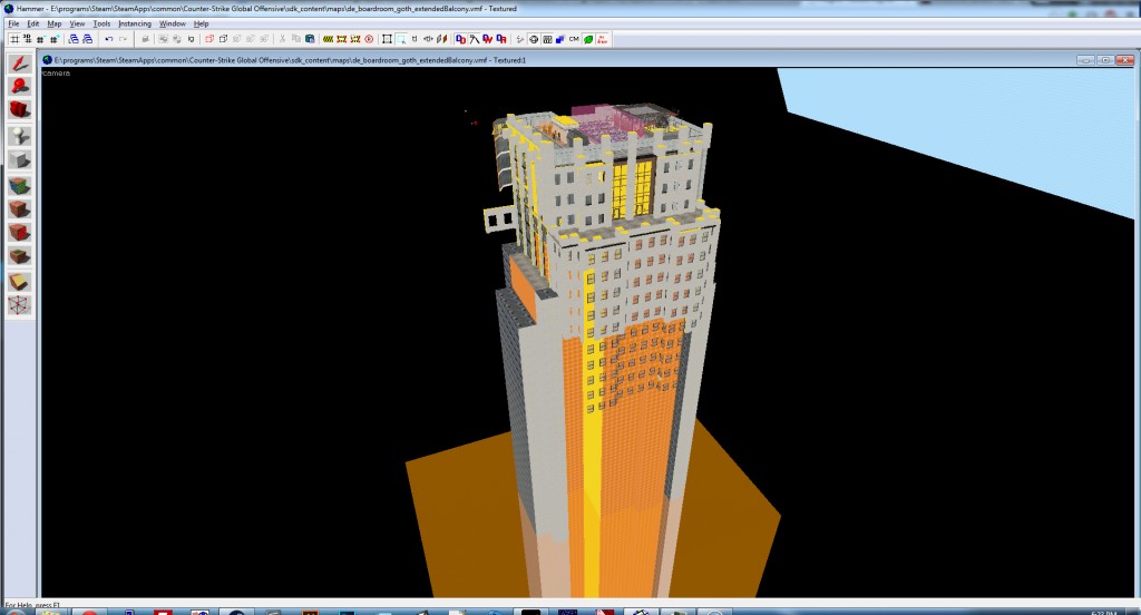
After a lot of debating and hem-hawing, I’m switching the architectural skin of the building from a generic modern look to an older and move developed Neo Gothic (with a touch of Art Deco) style. The old floor to ceiling windows on most rooms will be gone, and the general feel of the level will be much more rich.
Originally, I started this level before the now-famous Agency was released. Agency is an amazing work, and though my original goal was to create a modern skyscraper with that sort of detail, I never solidified the exterior design and what exists on the outside (and parts of the inside) are too reminiscent of Agency. This is not to say I’m drastically changing the flow, but the level finally has a real theme, instead of what was essentially a generic modern building that could be backdrop material in GTA.
That said, here’s an early shot which shows the new direction. The work is still rough and I’m working mainly at this point to nullify horrible redo mistakes by completely implementing this change in a copy of the level, then doing it again it in the actual level. Like in programming, everything is easier the second or third time you do it. Since I can only work at most a few hours a week on this project, I have to go in like a surgeon, or I would simply destroy a lot of work that would have to be redone over a course of weeks. Measure twice, cut once.
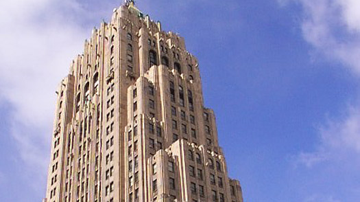
The styling and structure will be based off of a number of images and actual buildings, namely the Fisher Building in Detroit.
Tweet